Figma, Notion
UX/ UI Design
Turning travel complexity into simple digital experiences.
UX/ UI Design
Role
UX/ UI Design
Role
2024
Shipped
2024
Shipped
UX Research, Prototype, Wireframe, AI Integration
Responsibilities
UX Research, Prototype, Wireframe, AI Integration
Responsibilities

Define your world
We believe the way you explore is the soul of the journey. So we crafted every interaction to honor your unique path.
Mapping
Friction.
We moved beyond surface-level UI critique. Through 24 moderated sessions and diary studies, we mapped what we called the "Planning Fatigue Syndrome" — users switching between 7–10 tabs per booking session, creating a compounding drop-off risk at every context switch.
Key insight: users didn't want more options. They wanted one intelligent, opinionated system that earns their trust quickly and removes cognitive load entirely.

"Viaje Bueno is my command center. Filtering by exact time windows is the only way I manage work-life balance on the road."

"Price volatility is my biggest stress point. I need to know I'm locked into the best deal — in real time, without second-guessing."

"If a price drops after I book, I need the platform to have my back automatically. Trust is the whole product."

"Local routes through Tuscany are completely invisible on mainstream apps. I end up back on Google every single time."
Where it
Hurts.
Synthesizing 24 user sessions, we identified three recurring pain clusters that drove abandonment and eroded trust across the entire booking journey.
Users struggle to find destinations they can actually afford that still deliver the experience they need. Budget uncertainty kills decision momentum.
Lack of confidence that they are getting the best deal for the best destination. Price volatility and opaque comparisons drive users to competitor tabs.
Being a team player and getting everyone to agree on the same destination that also suits individual preferences is a coordination nightmare.
Defining
Who.
Two distinct behavioral archetypes emerged — each demanding radically different solutions from the same product.

Alice - Persona # 1.
Age: 27 - 45 years old
€85k / year
Maximize comfort and time efficiency. Needs premium, opinionated routing — she values the right answer over the cheapest answer.
Manual data entry, absent concierge logic, and multi-step flows. Abandons checkout within 90 seconds of confusion.

Thomas - Persona # 2.
Age: 18 - 25 years old
€42k / year
Extreme cost optimization with full transparency. Loves multimodal, unconventional routes — if it saves €30, he's in.
Hidden fees, lack of regional connection data, and no price-drop notifications after booking.
The Full
Journey.
We built a full 7-step Customer Journey Map to surface every emotional inflection point, friction zone, and opportunity across the Viaje Bueno experience. This is a condensed view of the four critical steps where design decisions had the highest business impact.
The original CJM covers 7 customer steps — from inspiration to post-trip loyalty. The showcase below highlights the four stages that drove our core design decisions.
Get key information, decide if the trip is viable, find inspiration.
Find a specific trip to book — narrow the shortlist.
Choose the best result — the right balance of price, time, and comfort.
Buy tickets with no friction, no surprises, no errors.
Every trip is a complete travel cycle.
We designed the one
worth coming back to.
Viaje Bueno Travel was built on a single truth: the journey doesn't end when you arrive. It is a continuous travel cycle — from home, to destination, and back again — shaped by every transport choice, every price decision, every moment of trust between traveller and platform.
Now a registered trademark across Latin America and entering the European market, Viaje Bueno is more than a product. It is a design philosophy — that intelligent, opinionated travel systems create loyal travellers, not just completed bookings.
We design circular experiences — every ending is the start of the next trip.
One intelligent recommendation beats ten confusing options, every time.
A registered brand signals permanence. We are here for the long journey.
Designing
Consistency.
Using a complex style guide instead of a design system resulted in inconsistent product appearance across platforms. We built a structured Design System to reduce handoff friction, eliminate human error, and keep teams focused on solving user problems — not reconciling visual discrepancies.
The system is structured into three layers: Foundation, Component Library, and Usage Guidelines.
- —Design Principles
- —Perceptual Patterns
- —Color System
- —Typography
- —Iconography
- —Images Library
- —Grid System
- —Layouts
- —Buttons & CTAs
- —Form Elements
- —Navigation Patterns
- —Cards & Containers
- —Data Display
- —Modals & Overlays
- —Notifications
- —Empty States
- —Accessibility Standards
- —Brand Voice & Tone
- —Motion Guidelines
- —Platform Adaptations
- —Contribution Rules
The Product
In Action.
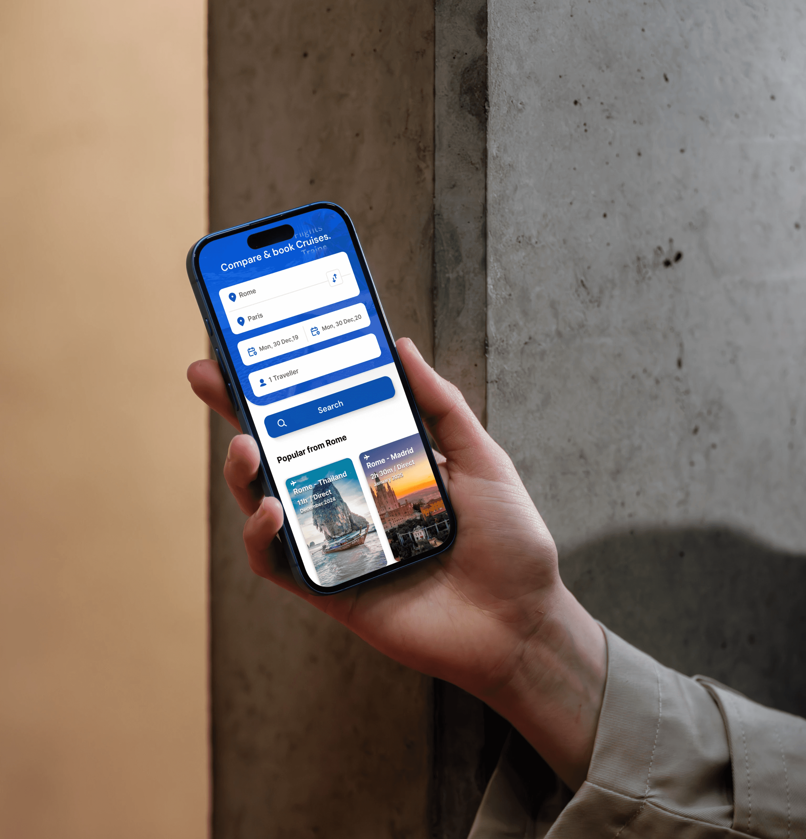
The main landing page was redesigned from the ground up — translating all research, personas, and journey map insights into a high-converting, trust-first interface. Every section was crafted to remove friction and guide the user toward their first booking with confidence.

Combine.
Compare.
Any means of transport — into one intelligent trip. The Connection Cards component was designed to let users compare and book what works best for them: fastest, cheapest, or most eco-friendly — all in one interface.
Results that speak
to the bottom line.
"Design at this scale is about Trust, not just Pixels."